Flashcard App: Build a Learning Tool with CRUD Features and Virtual Screen Techniques
Create a Flashcard learning app.
In this tutorial, we will create a flashcard app that can be used for learning. The cards are stored in a TinyDB. In addition to a study mode, the app also includes basic database functionality with CRUD operations (Create, Read, Update, Delete).
You can download the source code (aia file) from the download section at the bottom of the page.
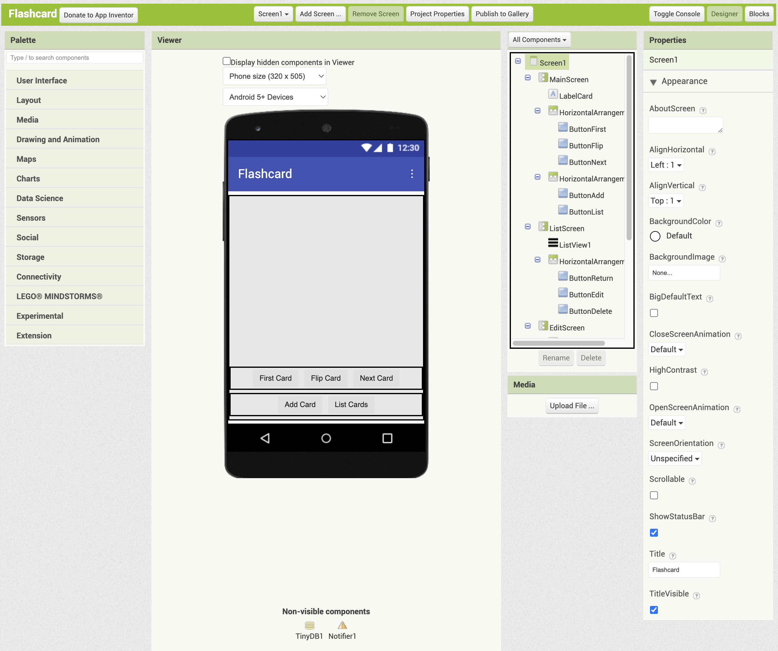
This app uses three screens, but setting the same global variables for each screen and reusing the same components, such as a TinyDB, on every screen would be cumbersome. So instead, it uses a virtual screen technique, where only Screen1 is used and the three screens are switched within it.
With virtual screens, multiple Vertical Arrangement components are placed on Screen1, and their Visible property is turned on and off in the Blocks Editor to switch between screens.
From the [Projects] menu, select [Start new project] and name it “Flashcard".
See this page for details on the Designer and Blocks Editor.
What You Will Learn in This Tutorial
- How to use Lists
- How to use ListView
- How to use Notifier
- How to use TinyDB
- How to use Virtual Screen
Components Used
Label, ListView, TextBox, Button, Notifier, HorizontalArrangement, VerticalArrangement, TinyDB
Blocks Used
Global Variable, Local Variable, If then else, List, Procedure
Designer
Set the title of Screen1 to “Flashcard".
Virtual Screens
Add three VerticalArrangement components from the Layout palette and arrange them vertically on the viewer. Name them MainScreen, ListScreen, and EditScreen from top to bottom. Set the Height and the Width of all of them to 'Fill parent’. Each VerticalArrangement component serves as a virtual screen.
When adding components to a particular VerticalArrangement component (screen), make sure to uncheck the Visible property of the other screens while you work.
Use these procedures to switch between screens.
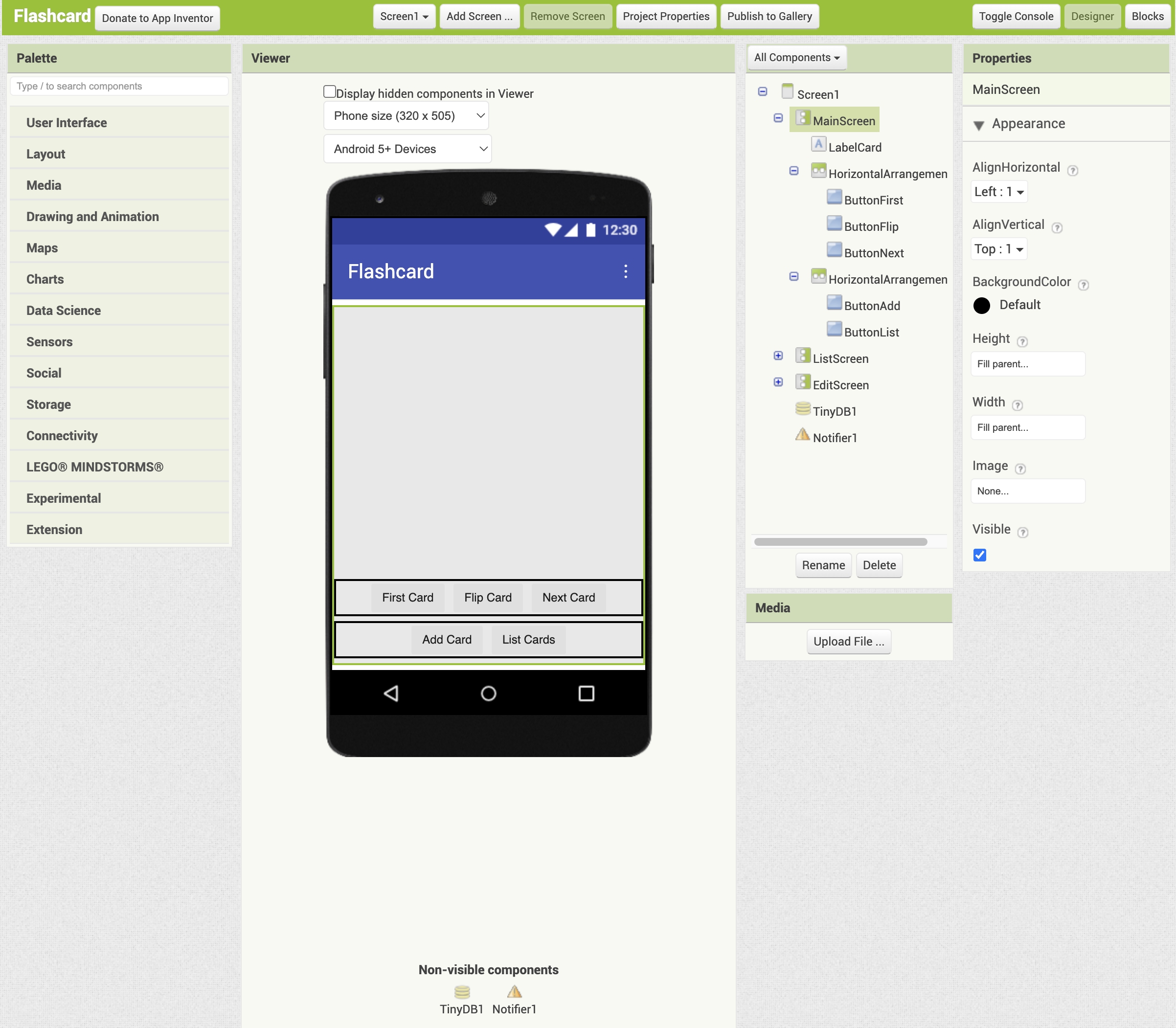
MainScreen
- Add one Label from the User Interface palette. Name it LabelCard, set both its height and width to Fill Parent, and leave the text empty.
- From the Layout palette, add a HorizontalArrangement component below LabelCard. Set AlignHorizontal to Center and the Width to Fill Parent. The name should be HorizontalArrangement1.
- Inside HorizontalArrangement1, add three Buttons from the User Interface palette. From left to right, name them ButtonFirst, ButtonFlip, and ButtonNext, and set their text to “First Card", “Flip Card", and “Next Card", respectively.
- From the Layout palette, add another HorizontalArrangement below HorizontalArrangement1. Set AlignHorizontal to Center and the Width to Fill Parent. The name should be HorizontalArrangement2.
- Inside HorizontalArrangement2, add two Buttons from the User Interface palette. From left to right, name them ButtonAdd and ButtonList, and set their text to “Add Card" and “List Cards", respectively.
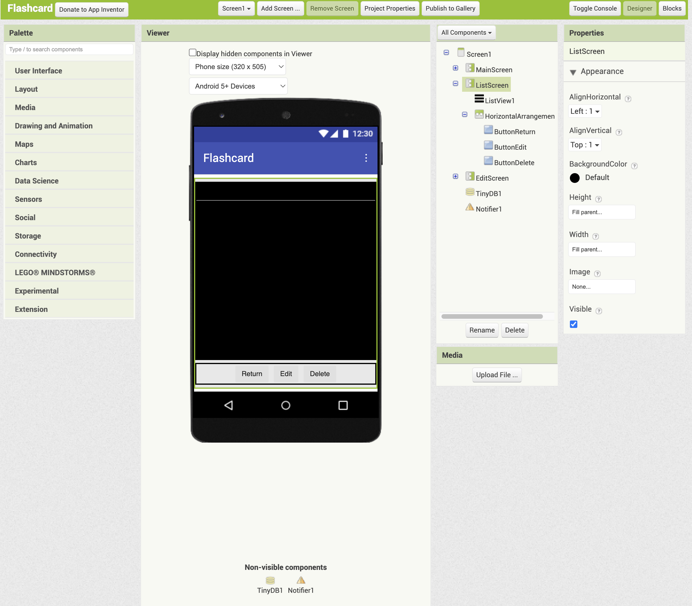
ListScreen
- Add a ListView from the User Interface palette. Set both its Height and Width to Fill Parent, and set the ListView Layout to MainText. The name should be ListView1.
- From the Layout palette, add a HorizontalArrangement component below ListView1. Set AlignHorizontal to Center and the Width to Fill Parent. The name should be HorizontalArrangement3.
- Inside HorizontalArrangement3, add three Buttons from the User Interface palette. From left to right, name them ButtonReturn, ButtonEdit, and ButtonDelete, and set their text to “Return", “Edit", and “Delete". respectively.
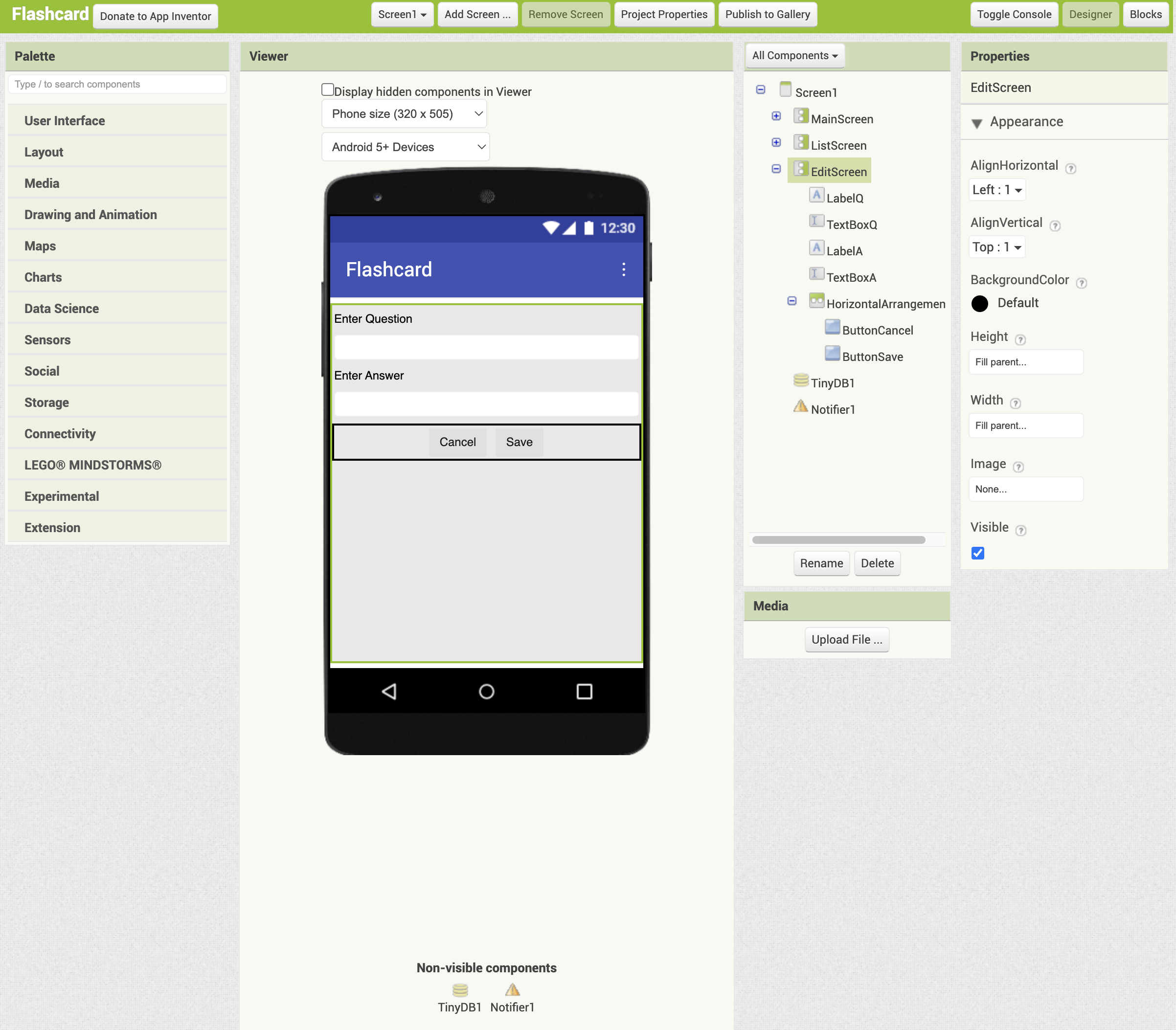
EditScreen
- From the User Interface palette, add a Label, TextBox, Label, and TextBox in that order. Name them LabelQ, TextBoxQ, LabelA, and TextBoxA, respectively. Set their text to “Enter Question", “", “Enter Answer", and “".
- Set the Width of TextBoxQ and TextBoxA to Fill Parent, and make sure to check MultiLine for both.
- From the Layout palette, add a HorizontalArrangement component below TextBoxA. Set AlignHorizontal to Center and the Width to Fill Parent. The name should be HorizontalArrangement4.
- Inside HorizontalArrangement4, add two Buttons from the User Interface palette. From left to right, name them ButtonCancel and ButtonSave, and set their text to “Cancel" and “Save", respectively.
Add non-visible components
As non-visible components, add one Notifier (Notifier1) from the User Interface palette, and one TinyDB (TinyDB1) from the Storage palette.